- Developer tutorials
How to create custom content bricks

Intro
If you have been following along, you may have read the tutorial on how to create a blog with React Bricks and Next.js. This guide builds upon that tutorial, so you will need a working React Bricks app before you can proceed and create your own content blocks.
In this tutorial, we will explore the structure of a React Bricks project, focusing on the /bricks folder. We'll look at how bricks are organized and learn how to create new custom bricks to implement your own corporate image.
Prerequisites
- A code editor, like VSCode
- Basic knowledge of React
- A working React Bricks app, created following the previous tutorial
What is a brick?
In simple terms, bricks are special React components that are visually editable and which props can be customized by content creators using a set of sidebar controls.
Creating our first brick
Exploring the /bricks folder
First, let’s open our code editor. Ready? Cool.
The /bricks folder is a crucial part of your React Bricks project. It contains the bricks, which are the building blocks for your website's pages.
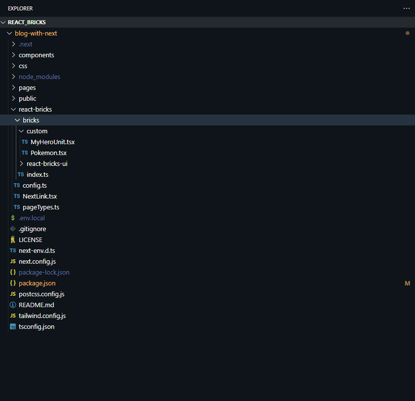
If you go to your code editor, you can find the react-bricks/bricks directory in your project structure. The bricks folder in the starter projects with Tailwind is divided into two subfolders:
react-bricks-ui: This is where the pre-made bricks are located. You can use them to experiment with React Bricks, but they are typically deleted for a real corporate website, where a custom design system is needed.custom: here you can find two example custom bricks. This is the starting point where you will create all of your custom bricks to implement the corporate image of you company or that of your customers, if you are a digital agency.
What’s more, there is the index file, which imports all the bricks and makes them available to the React Bricks configuration, so that they can be used in the project.
Other configuration settings can be found in the react-bricks/config.ts file. This file contains important settings that determine the behavior of React Bricks. The _app.tsx file includes additional configurations, such as settings for dark mode.

Understanding a brick’s structure
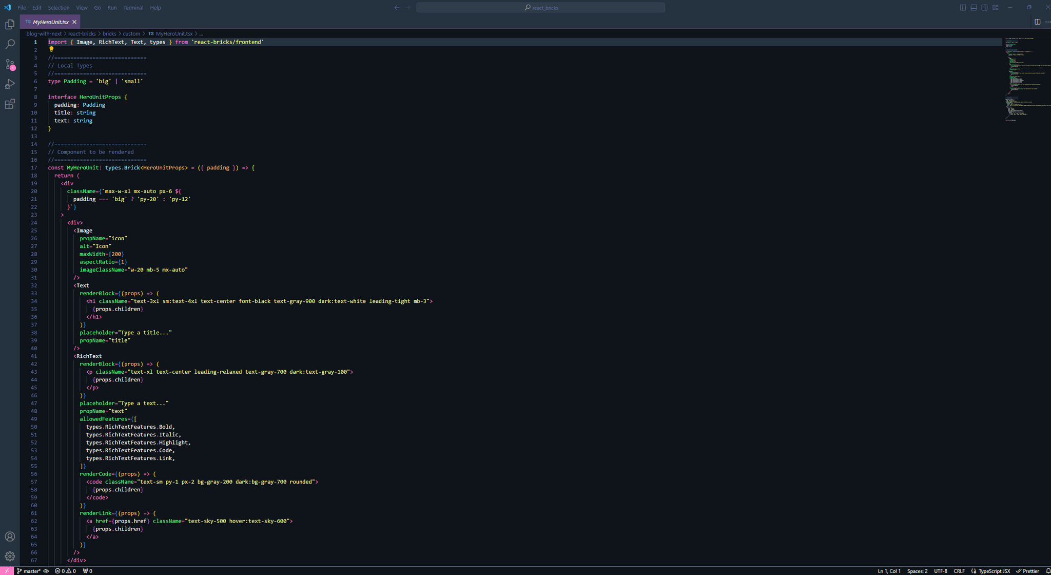
Now, let’s have a look for the MyHeroUnit.tsx file. This file contains the code for an example “hero unit” brick.
Here are a few things to note:
- It is a React component with a TypeScript type of "brick". A brick is a special React component that has a
schemaproperty, which we'll see shortly. - In the JSX of the component, you can see special visual editing components provided by React Bricks, such as Text, RichText, and Image. These components enable visual editing capabilities! ✨
- The
schemaproperty is where you can configure the behavior of your brick and define the sidebar controls that allow the content editor to change certain properties of the brick. - The
paddingproperty, which is configured as a select control in the sidebar, becomes a prop for your React component. It is used to conditionally render different CSS classes.

Creating our first brick
Ok, time to create something new!
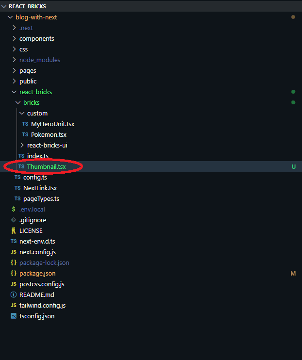
I'll walk through the process of adding a new brick, specifically a Thumbnail brick. We'll start by creating the brick and then integrate it into your project. So, navigate to the bricks folder in your project and create a new file named Thumbnail.tsx.

Now open the file and add the following code
import React from 'react'
import { types } from 'react-bricks/frontend'

const Thumbnail: types.Brick = () => {
  return <div className="p-6 text-center">Thumbnail</div>
}

Thumbnail.schema = {
  name: 'Thumbnail',
  label: 'Thumbnail',
}

export default Thumbnail
A peek inside the brick
You see that a brick is a normal React functional component with a schema static property.
The minimal configuration required for a brick includes:
name: A unique name for the brick.label: A user-friendly name for the brick shown to the content editors.
Adding bricks to React Bricks’ UI
To integrate the Thumbnail.tsx brick into your project, you need to update the index.ts file in the bricks folder. Open the index.ts file located in the bricks folder and update the file with the following code:
import { types } from 'react-bricks/frontend'
import HeroUnit from './custom/MyHeroUnit'
import reactBricksUITheme from './react-bricks-ui'
import Thumbnail from './Thumbnail'

const bricks: types.Theme[] = [
  reactBricksUITheme,// React Bricks UI
  {
    themeName: 'Custom Theme 1',
    categories: [
      {
        categoryName: 'Hero sections',
        bricks: [HeroUnit, Thumbnail],// Custom Bricks
      },
    ],
  },
]

export default bricks
This code adds the Thumbnail brick into your project, making it available for use.
Testing block in React Bricks UI
Now that the Thumbnail brick has been integrated, let's test it. Open your terminal and start the project with npm run dev. Now click on the “Edit content” button (or go the the /admin directory in the browser address bar).
After logging in, go to your page and click on the [+] sign below your block.
Choose the “Thumbnail” brick from the options in the right sidebar. A new Thumbnail block will appear on the page.

You will notice that even though we added the Thumbnail, it still lacks visual editing capabilities. This is normal, as we haven't added any interactive or editable features to the brick yet.
Adding visual editing
Adding a Text component to our brick
Let’s spice up our brick by adding an editable text component. This will enable users to click on the text and make direct edits within the user interface. We'll start by updating the Thumbnail.tsx file and replacing the static "Thumbnail" text with an editable Text component from React Bricks. Open the Thumbnail.tsx file and replace its content with the following code:
import React from 'react'
import { types, Text } from 'react-bricks/frontend'

const Thumbnail: types.Brick = () => {
  return (
    <div className="p-6 text-center">
    <Text
      propName="title"
      renderBlock={({ children }) =>
        <h1 className="text-2xl font-bold">
          {children}
        </h1>
      }
      placeholder="Type a title..."
    />
   </div>
   )
}

Thumbnail.schema = {
  name: 'thumbnail',
  label: 'Thumbnail',
}

export default Thumbnail
A peek inside the brick
We replaced the static “Thumbnail” text with the Text component from React Bricks, setting the following props on it:
propName: This is the name of the prop for the text. In this case, we used"title".renderBlock: A functional component that renders the text. Here, we're rendering the text inside an<h1>tag with some styling.placeholder: This is the hint text displayed when the editable text is empty.
You can also add these two optional boolean props:
multiline: Set this totrueif you want to allow multiline text.softLineBreak: If set totrue, it allows for soft line breaks.
By default, React Bricks' Text component displays "New text" when no default content is provided. We'll change this by setting a custom default text.
We need to modify the Thumbnail.tsx file to include a getDefaultProps function in the brick's schema. This function will return the default properties for the brick when it's added to a page. Open the Thumbnail.tsx file and update the Thumbnail.schema section as follows:
Thumbnail.schema = {
name: 'thumbnail',
label: 'Thumbnail',
getDefaultProps: () => ({
  title: 'Hello, world!'
}),
}

export default Thumbnail
A peek inside the brick
getDefaultProps: This function returns an object containing default properties for the brick.title: We set the default value of thetitleproperty to'Hello, world!'. This text will be displayed by default when a newThumbnailbrick is added.
Hit Save, refresh your browser and add a new “Thumbnail” brick to see the changes:

If you click on “Hello, world!”, you’ll be able to edit the text. But that’s not all you can do with a brick: we’re only scratching the surface. Let’s dive deeper!
Adding a RichText component
Enhancing the user experience with text formatting is a great way to make your React Bricks project more dynamic. Let’s add a RichText component to the Thumbnail brick, allowing for text formatting such as bold and highlight.
If you prefer a shorter focused walkthrough, see the Add rich text how-to.
Go back to our old friend Thumbnail.tsx and add the RichText component to the JSX code and the proper default value in the getDefaultProps function , like this:
import React from 'react'
import { types, Text, RichText } from 'react-bricks/frontend'

const Thumbnail: types.Brick = () => {
return (

<div className="p-6 text-center">
<Text
  propName="title"
  renderBlock={({ children }) => (
    <h1 className="text-2xl font-bold">{children}</h1>
  )}
  placeholder="Type a title..."
/>
<RichText
  propName="description"
  renderBlock={({ children }) => (
    <p className="text-lg text-gray-500">{children}</p>
  )}
  placeholder="Type a description"
  allowedFeatures={[
    types.RichTextFeatures.Bold,
    types.RichTextFeatures.Highlight,
  ]}
/>
</div>
) }

Thumbnail.schema = {
  name: 'thumbnail',
  label: 'Thumbnail',
  getDefaultProps: () => ({
    title: 'Hello, world!',
    description: 'Lorem ipsum dolor sit amet.',
  }),
}

export default Thumbnail
You can now edit also the description text below the headline. Additionally, if you select a portion of this text, you have the option to apply bold or highlight styles.

A peek at the brick
propName: This is set to"description"for the RichText component.renderBlock: This time, it's a paragraph with some styling.placeholder: Text displayed when the editable area is empty.allowedFeatures: Specifies the styling features that are enabled. We've enabledBoldandHighlight.
Changing the highlight color
Let’s override the default rendering of the highlight style in the RichText component to customize its colors.
Open the Thumbnail.tsx file and update the RichText component as follows:
<RichText
propName="description"
renderBlock={({ children }) => (
  <p className="text-lg text-gray-500">{children}</p>
)}
placeholder="Type a description"
allowedFeatures={[
  types.RichTextFeatures.Bold,
  types.RichTextFeatures.Highlight,
]}
renderHighlight={({ children }) => (
  <span className="px-1 rounded-sm bg-blue-200 text-blue-900">
    {children}
  </span>
)}
/>

A peek at the brick
renderHighlight: This function overrides the default rendering of the highlight feature.className: We have applied a custom class to the<span>element that wraps the highlighted text. In this example, the background is set to light blue (bg-blue-200), and the text color is set to dark blue (text-blue-900).- Pro tip: Use these colors to change the color of the highlight. Just replace the
blue-200andblue-900parts with other colors from the Tailwind color palette.
Adding an image
A thumbnail is not complete without an image!
To enhance the visual appeal and functionality of the thumbnail, let's add an Image component from React Bricks.
Open Thumbnail.tsx and paste the following code:
import React from 'react'
import { types, Text, RichText, Image } from 'react-bricks/frontend'

const Thumbnail: types.Brick = () => {
return (

<div
className="my-6 p-6 mx-auto text-center
    border rounded-lg max-w-sm shadow-xl"
>
<Image
  propName="image"
  alt="Fallback alt tag"
  maxWidth={400}
  imageClassName="mb-6"
/>
<Text
  propName="title"
  renderBlock={({ children }) => (
    <h1 className="text-2xl font-bold">{children}</h1>
  )}
  placeholder="Type a title..."
/>
<RichText propName="description" renderBlock={({ children }) => <p className="text-lg text-gray-500">{children}</p>} placeholder="Type a description" allowedFeatures={[types.RichTextFeatures.Bold, types.RichTextFeatures.Highlight]} />
</div>
) }

Thumbnail.schema = {
  name: 'thumbnail',
  label: 'Thumbnail',
  getDefaultProps: () => ({
  title: 'Hello, world!',
  description: 'Lorem ipsum dolor sit amet.',
}),
  sideEditProps: [],
}

export default Thumbnail
A peek at the brick
We added the Image component to add an editable image, setting the following props:
propName: Set to"image"for the image prop.alt: A fallback alt tag for the image, if the content editor doesn’t provide a proper alt text.maxWidth: Sets the maximum width of the image. This value is used by the React Bricks servers to optimize the image. The maximum width of the responsive images created will be 2 times this width to comply with retina displays.imageClassName: Adds margin to the bottom of the image.
Now let’s test the new brick’s functionalities.

Look, we now have a rich text field and an image. Cool, isn’t it?
Click on the image placeholder: a popup opens. Select “Replace image” > “Upload” to choose an image file from your computer and upload it. Then you can set an alt tag and a SEO-friendly name for the final part of the URL.
If you don't set any alt tag, the fallback alt specified on the Image component is used instead.

Look, I added an image and a descriptive text!
Image optimization
React Bricks introduces an advanced approach to image optimization, ensuring efficient loading and high-quality display across various devices.
React Bricks automatically generates multiple versions of each uploaded image to accommodate different screen resolutions. It creates responsive versions of each image and uses the proper sourceSet to serve the best image based on the screen resolution.
Additionally, it enables lazy loading by leveraging the native browser lazy-load feature, if available. Otherwise, it shows a blurred, low-resolution version of the image when it's outside of the viewport, and replaces it with the full image when it comes into view. This improves the page load performance. But this is something for a separate tutorial, so in the meantime feel free to consult our documentation.
React Bricks docs: Image component
Adding sidebar props
React Bricks allows for dynamic customization of components using sidebar props. To show you how that works, we will add a hasShadow boolean prop to the Thumbnail brick, enabling users to toggle a shadow effect through a checkbox in the sidebar.
For the same concept in a compact step-by-step format, see Add a sidebar control.
So, let’s update —again— our Thumbnail.tsx snippet with the following code:
import React from 'react'
import { types, Text, RichText, Image } from 'react-bricks/frontend'

interface ThumbnailProps {
  hasShadow: boolean
}

const Thumbnail: types.Brick<ThumbnailProps> = ({ hasShadow }) => {
  return (
    <div
      className={`my-6 p-6 mx-auto text-center border max-w-sm rounded-lg
      ${hasShadow ? 'shadow-xl' : ''}`} >
      <Image
        propName="image"
        alt="Fallback alt tag"
        maxWidth={200}
        imageClassName="mb-6"
      />
      <Text
        propName="title"
        renderBlock={({ children }) => (
          <h1 className="text-2xl font-bold">{children}</h1>
        )}
        placeholder="Type a title..."
      />
      <RichText
        propName="description"
        renderBlock={({ children }) => (
          <p className="text-lg text-gray-500">{children}</p>
        )}
        placeholder="Type a description"
        allowedFeatures={[
          types.RichTextFeatures.Bold,
          types.RichTextFeatures.Highlight,
        ]}
        renderHighlight={({ children }) => (
          <span className="px-1 rounded-sm bg-blue-200 text-blue-900">
            {children}
          </span>
        )}
      />
    </div>
  )
}

Thumbnail.schema = {
  name: 'thumbnail',
  label: 'Thumbnail',
  getDefaultProps: () => ({
    title: 'Hello, world!',
    description: 'Lorem ipsum dolor sit amet.',
    hasShadow: true
  }),
  sideEditProps: [
    {
      name: 'hasShadow',
      label: 'Shadow',
      type: types.SideEditPropType.Boolean,
    },
  ],
}

export default Thumbnail
Look. the difference may be subtle, but there’s a shadow in the brick and a toggle to turn it on and off.

A peek inside the brick
ThumbnailProps: TypeScript interface with thehasShadowprop as a boolean.hasShadow: the prop that controls whether theshadow-xlclass is applied.SideEditProps: In the schema, we define a sidebar control forhasShadowas a control of type checkbox.
Types of controls
React Bricks supports a variety of control types for side edit props, such as TEXT, NUMBER, DATE, RANGE, BOOLEAN, SELECT, IMAGE and CUSTOM, enabling developers to create highly interactive and customizable UI components.
- The Text, Number, Date, and Range types render the expected HTML5 input control.
- The Select type, based on the
displayproperty, can be rendered as a Select, a Radio button or a Color selection interface. - The Image type renders an image upload interface to manage properties such as a background image.
- The Custom type lets you provide your own component to edit a sidebar prop (
componentproperty).
Working with colors
Of course you can also customize colors using sidebar controls. Let’s modify our old friend Thumbnail.tsx with the following code:
import React from 'react'
import { types, Text, RichText, Image } from 'react-bricks/frontend'

interface ThumbnailProps {
  hasShadow: boolean
  bgColor: types.IColor
}

const Thumbnail: types.Brick<ThumbnailProps> = ({ hasShadow, bgColor }) => {
  return (
    <div
      className={`my-6 p-6 mx-auto text-center border rounded-lg max-w-sm
      ${hasShadow ? 'shadow-xl' : ''} ${bgColor?.className}`} >
      <Image
        propName="image"
        alt="Fallback alt tag"
        maxWidth={200}
        imageClassName="mb-6"
      />
      <Text
        propName="title"
        renderBlock={({ children }) => (
          <h1 className="text-2xl font-bold">{children}</h1>
        )}
        placeholder="Type a title..."
      />
      <RichText
        propName="description"
        renderBlock={({ children }) => (
          <p className="text-lg text-gray-500">{children}</p>
        )}
        placeholder="Type a description"
        allowedFeatures={[
          types.RichTextFeatures.Bold,
          types.RichTextFeatures.Highlight,
        ]}
        renderHighlight={({ children }) => (
          <span className="px-1 rounded-sm bg-blue-200 text-blue-900">
            {children}
          </span>
        )}
      />
    </div>
  )
}

Thumbnail.schema = {
  name: 'thumbnail',
  label: 'Thumbnail',
  getDefaultProps: () => ({
    title: 'Hello, world!',
    description: 'Lorem ipsum dolor sit amet.',
    hasShadow: true,
    bgColor: { color: '#ffffff', className: 'bg-white' }
  }),
  sideEditProps: [
    {
      name: 'hasShadow',
      label: 'Shadow',
      type: types.SideEditPropType.Boolean,
    },
    {
      name: 'bgColor',
      label: 'Background',
      type: types.SideEditPropType.Select,
      selectOptions: {
        display: types.OptionsDisplay.Color,
        options: [
          {
            label: 'White',
            value: { color: '#ffffff', className: 'bg-white' },
          },
          {
            label: 'Light blue',
            value: { color: '#eff6ff', className: 'bg-blue-50' },
          },
        ],
      },
    },
  ],
}

export default Thumbnail
Now you can change the background to gray or white.

A peek inside the brick
ThumbnailPropsnow includesbgColorof typetypes.IColor.- In the sideEditProps we added a select control with
displayset astypes.OptionsDisplay.Color. In this case the values of the options should be objects that have at least acolorproperty, which defines the color to be displayed in the color picking interface. We can include additional properties in this object as well. In this case, we added aclassNameproperty, which is useful for managing styles with Tailwind CSS.. - The prop
bgColoris then used to apply the selected background color.
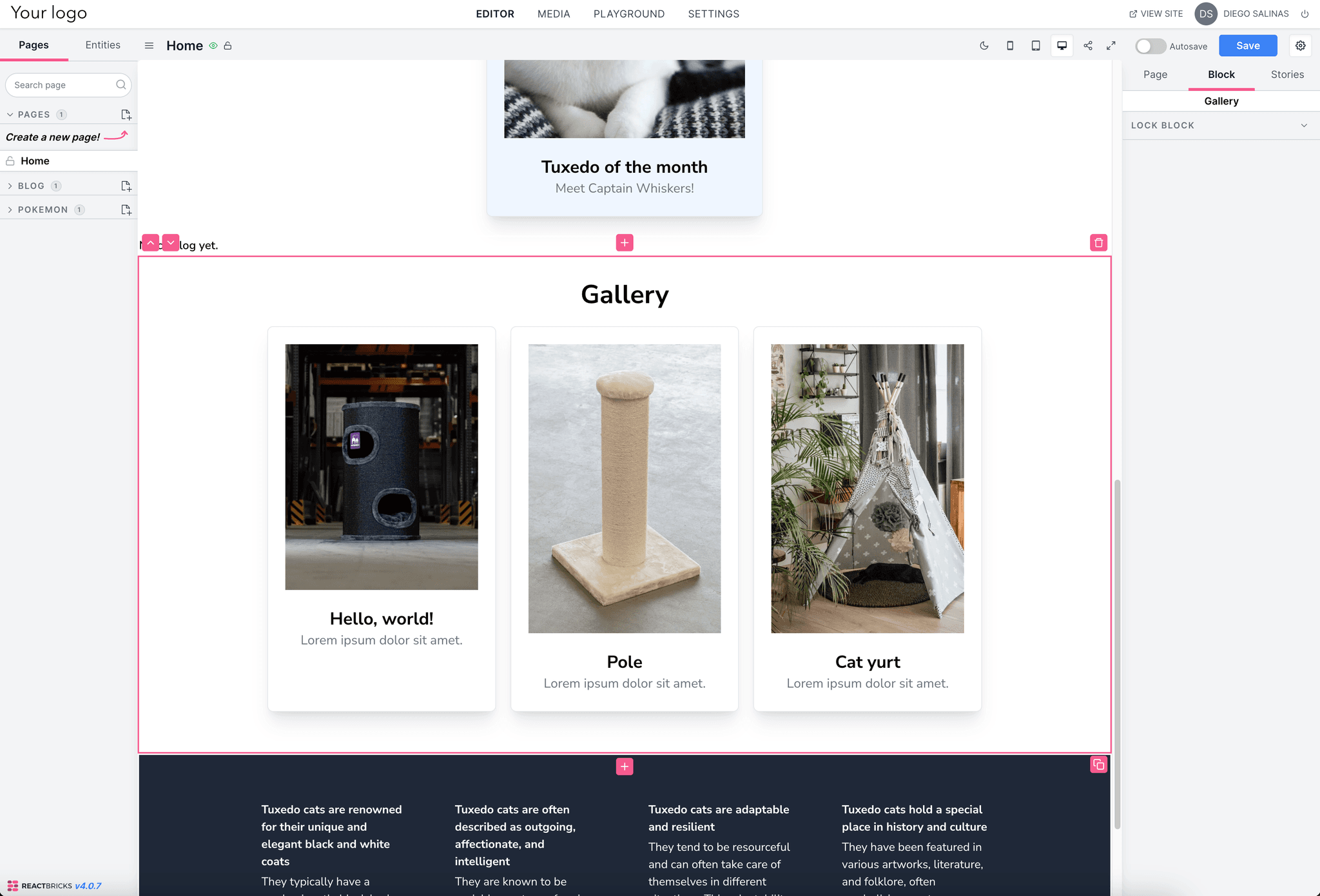
Adding a gallery
Creating the Gallery brick
We'll focus on implementing a Gallery brick, using the <Repeater> component and the repeaterItems property in the schema.
To do that, let’s create a new file under /bricks called Gallery.tsx. This file corresponds to the Gallery brick.
import React from 'react'
import { types, Repeater } from 'react-bricks/frontend'

const Gallery: types.Brick = () => {
return (

<div className="max-w-5xl mx-auto py-8 px-4">
<h1 className="text-4xl font-bold text-center">Gallery</h1>
<div className="sm:grid grid-cols-3 gap-5">
  <Repeater propName="thumbnails" />
</div>
</div>
) }

Gallery.schema = {
  name: 'gallery',
  label: 'Gallery',
  getDefaultProps: () => ({
    thumbnails: [],
  }),
  repeaterItems: [
    {
      name: 'thumbnails',
      itemType: 'thumbnail',
      itemLabel: 'Thumbnail',
      max: 3,
    },
  ],
}

export default Gallery
Pro tip: Remember to import the Gallery brick in the index.ts file just like we did with the Thumbnail brick.
A peek inside the brick
- The
<Repeater>component plays a crucial role in our Gallery brick. It enables us to display a collection of items (in this case, thumbnails) that can be dynamically added, removed, or edited by the user. It should be rendered where you want the repeated items to appear in your layout. propNameis essential as it specifies which property in the schema holds the repeatable items.repeaterItemsschema defines the characteristics of the repeating items. We used the following props:name: The name of the prop in the schema (e.g., "thumbnails").itemType: The type of brick to be repeated (e.g., "thumbnail").itemLabel: A label for the UI, used in the "Add" menu.max: The maximum number of items allowed (optional).
- There are many other properties you can use: see the Documentation

You’re ready to push the changes to Github and rebuild the site.
Commit and push changes
You can now commit the changes and push to your Git remote, by using the editor interface or the Git CLI. Once your code is pushed to the remote, if you connected Vercel or Netlify to your repo, it will start the rebuild of your website.
That’s it!
Check the fully functioning website here: https://blog-with-next-two.vercel.app/